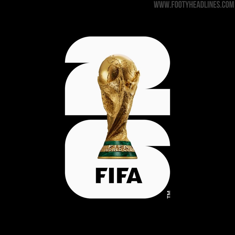
Revolutionary FIFA World Cup 2026 Logo Revealed
Last night, FIFA revealed the official logo for the 2026 World Cup, and it's underwhelming to say the least.
Fifa World Cup 2026 Logo
As is their wont, FIFA held an extremely glitzy ceremony last night to unveil the official logo and branding for the 2026 World Cup. The overall "branding" aspect seems to have taken on more significance than the logo itself, which is a departure from all the previous iterations. Traditionally, the World Cup logo has been designed to reflect the culture of the host nation(s) in some way, but that is not the case here.
FIFA say that the "timeless approach combines an image of the FIFA World Cup Trophy™ and the year of the tournament". They're not wrong there, as it's literally a photorealistic image of the famous trophy sitting on a thick typeface number 26. The colours can be customised to fit the various host cities and will fit into a wider visual branding scheme that uses the same design language.
The image of the trophy and the year allow for customisation to reflect the uniqueness of each host, while building an identifiable brand structure for years to come. - FIFA
It's definitely the most modern approach we've seen so far and although the colour customisation could end up being used to good effect, the logo itself lacks the character of tournaments gone by. The logos have been becoming more sterile over the last three or four World Cups, but this takes things to a new level of minimalism. Unsurprisingly, FIFA have literally put themselves at the centre of it all, removing any hint of the hosts' culture or national identity. It may turn out to be a grower, but it could never de described as charming in the same way the old logos could.
What's your take on the 2026 FIFA World Cup logo? Will it look good as a sleeve badge?


