LASK Present New Logo - Too Simple?

Along with their new 23-24 kits, LASK recently unveiled their new brand identity, including a reworked logo. Here is a closer look.

New LASK Logo
Here is a side-by-side comparison of the new logo with its predecessor.
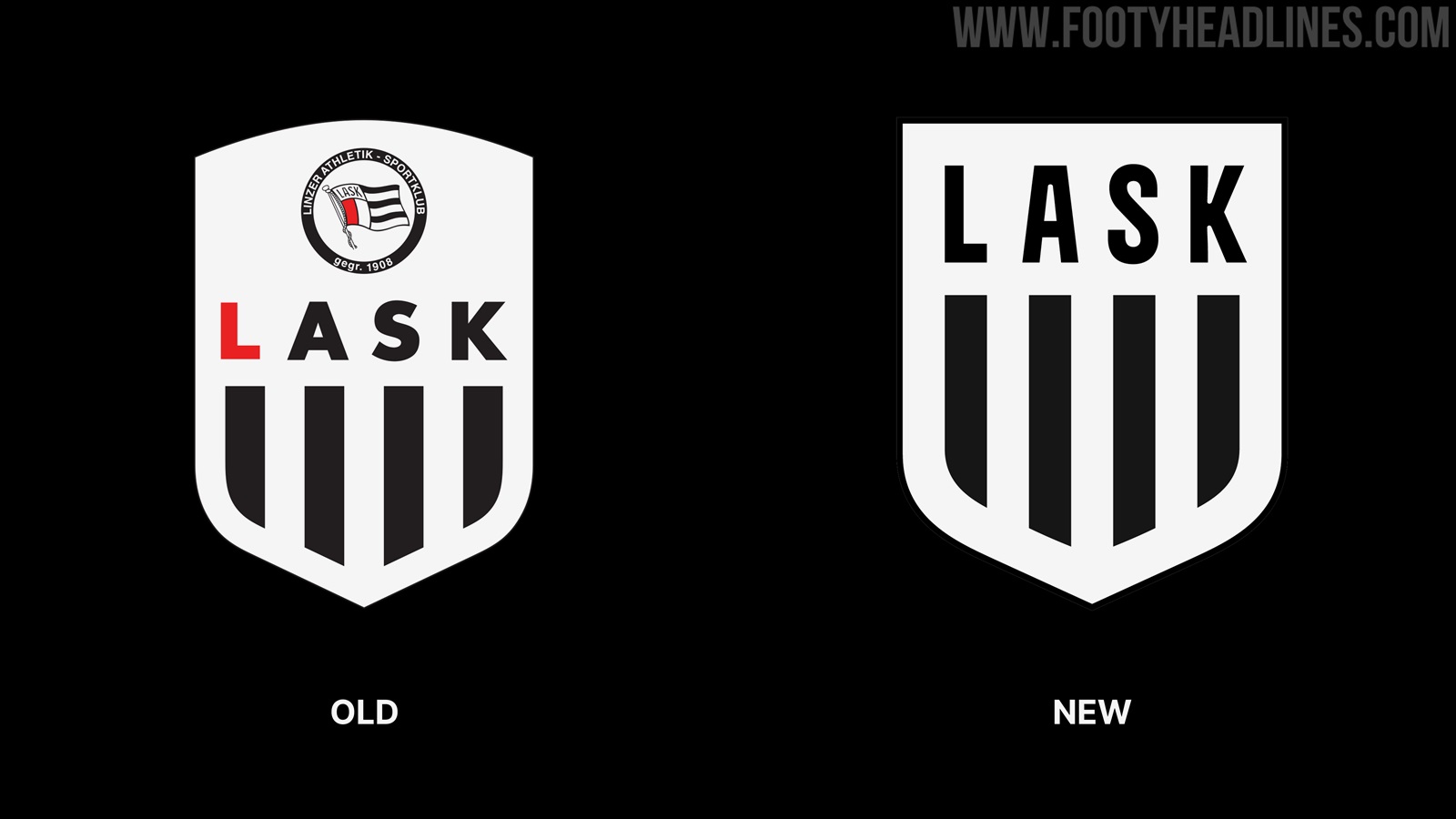
Firstly, the shield shape was retained, with the top going from rounded to flat. The four vertical black stripes at the bottom half are also retained, but slightly elongated.

A new font was developed for the club's brand, which is used for the team's intitials 'LASK'. Rather than having a red 'L', the entire lettering is black this time around.


Lastly, the small flag crest at the top was removed entirely from the new logo. The exclusively black and white color scheme allows for a great reversible design.
What do you think of LASK's updated logo? Is it better than the old version? Comment below.
Vintage Football Shirts
from Cult Kits
1995/97 Adidas GK 'Terminator' Template Shirt (S)

2017/18 Manchester United Home Shirt (S) Adidas

2000/02 Spain Mendieta #16 Away Shirt (L) Adidas

1998/00 Barcelona Rivaldo #11 Home Shirt (L) Nike

1994 Umbro Pro Training Jacket (M) Umbro

1998/99 Eintracht Frankfurt Away Shirt (XL) Puma

2004 Corinthians #10 Home Shirt (L) Nike

1999/00 Red Star Belgrade Away Shirt (XL) Kappa

2006/08 Netherlands L/S Away Shirt (XXL) Nike