Modena FC Unveil New Badge
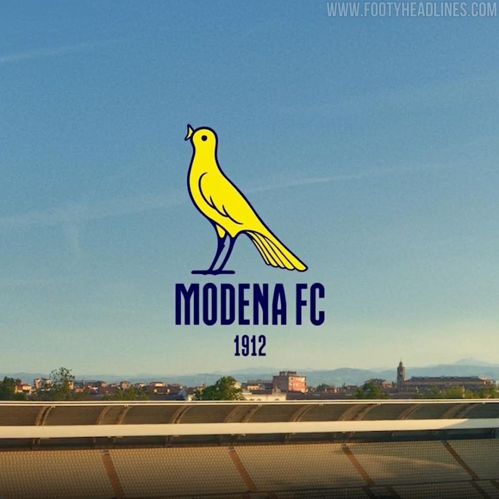
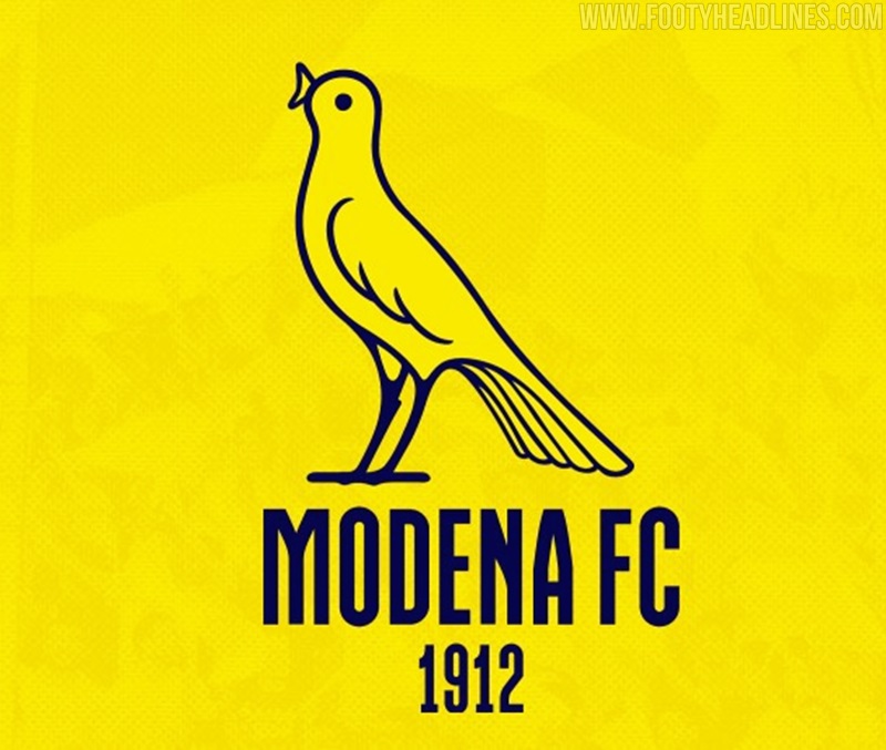
Italian side Modena today unveiled their new badge, which definitely stands out as one of the better updates we've seen recently.
Modena Unveil New Badge
Modena opted to forgo the trend of uber-modernisation, choosing instead to take a long-standing symbol of the club, the canary, and make it the crest, with Modena FC 1912 written beneath in navy text. Club owner, Carlo Rivetti, explained that the font comes from a local newspaper from the 1960s, Modena Flash.
The hand-drawn illustration style of the canary and its open beak, together with the choice of the font, give the badge plenty of character. The two tone colour scheme and absence of a border provide enough minimalism for it to be modern, yet at the same time preserve the identity of the club. Rivetti had this to say:
"It is a return to the future because the canary has always been part of the club's history, all the fans recognise it, and taking up the image of the canary in the world and in the world of football is an added value for the club and Modena fc. We have not invented anything, only that from today the canary becomes the protagonist. In a digital era it goes better with all devices, chromatically the gold has been removed to make it look better. It will be on the shirts from next season and will remain; it will not be combined with the old logo."
Modena have gotten everything right so far, even coming up with the perfect slogan for the rebranding, "ready to fly". Even more fitting considering that they gained promotion to Serie B at the end of last season.
The new canary crest will feature on the club's shirts from the 22-23 season onwards, as well as all other club-branded items.
What do you think of Modena's new crest? Share your thoughts below.


