
Have We Seen Enough Blackout Kits?
 Feb 26, 2025, by Chris
- Blackout Kit Popularity: Blackout kits, popularized by Borussia Dortmund in 2020, remain prevalent due to their commercial appeal and fashion versatility.
- Loss of Identity: The widespread adoption of generic blackout kits sacrifices club identity by abandoning traditional colors and visual heritage.
- Potential Solutions: Clubs should explore creative interpretations of blackout kits that incorporate elements of club identity, as seen in examples like AC Horsens and Barcelona.
Atlético Mineiro and AIK have jumped again on the blackout kit bandwagon, raising the question: has the football world reached peak blackout saturation? Big thanks to Soccer Jersey News (@soccerjerseynws) for the initial idea for this article.


Ubiquitous Black

When Borussia Dortmund released their hugely successful blackout kit in early 2020, they triggered a trend that shows little sign of abating. Nearly six years later, we continue to see a steady stream of all-black designs flooding the market. BVB's effort set the gold standard, quickly selling out 60,000 units and establishing a blueprint that dozens of clubs have since followed.
Blackout football shirts have become virtually indistinguishable from one another
But let's be honest - they've become virtually indistinguishable from one another. Beyond the different club crests and manufacturer logos, most blackout kits follow the exact same formula: black fabric, black details, black logos, and black sponsors. The result? A sea of sameness across clubs and leagues.

Atlético Mineiro's new blackout kit continues the trend
Commercial Appeal vs. Club Identity
It's not difficult to understand why blackout kits have become so prevalent. From a fashion perspective, they're incredibly versatile - easy to pair with virtually any outfit, making them appealing beyond match days. The continued commercial success of these kits (Dortmund's anniversary kit sold out "in moments") speaks to their popularity among supporters.
the commercial appeal comes at the cost of club identity
However, this commercial appeal comes at the cost of club identity. When a team abandons its traditional colors for an all-black design, it sacrifices something fundamental about its visual heritage. Ipswich Town, Sparta Rotterdam, Hull City, and now Atlético Mineiro - the list of clubs diluting their visual identity with generic blackout kits continues to grow.
Finding Balance

If blackout kits are here to stay, perhaps clubs should consider a middle ground. Denmark's AC Horsens showed one potential path forward by incorporating colored elements around the edges of their logos, retaining a touch of club identity while maintaining the sleek blackout aesthetic. Barcelona opted for a similar approach with its 24-25 away kit.
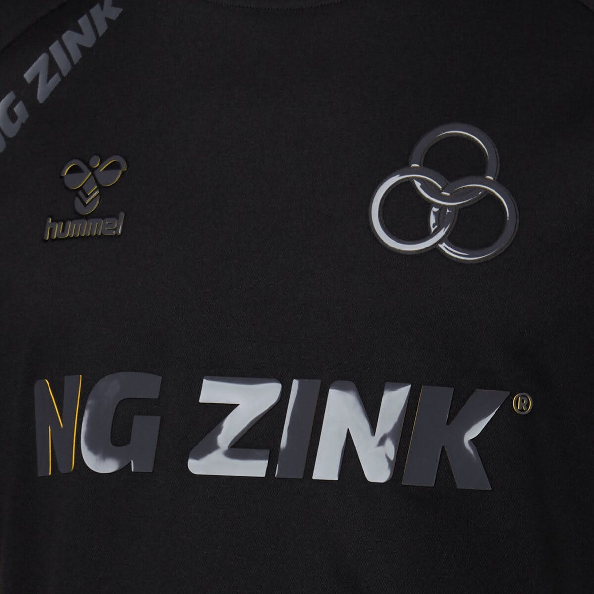
Without such distinguishing elements, blackout kits become simply generic black shirts with interchangeable logos - products divorced from club heritage and history.
The Historical Context

Amazing Blackout Manchester United 18-19 Tango Jersey Released
It's worth noting that Adidas actually preceded the current trend, releasing a retro-inspired Manchester United blackout kit in 2018, roughly 18 months before Dortmund's version ignited the full-blown craze. While we're seeing slightly fewer blackout releases than the peak two years ago, they remain a steady fixture in kit launches across the globe.
As Lorenzo Bottini from NSS Sports put it, these jerseys can be "worn both on the pitch and at La Scala's premiere," highlighting their versatility and broader appeal compared to traditional club colors.
Where Do We Go From Here?

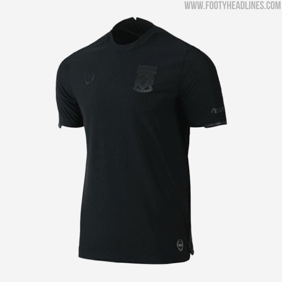


Fans have already started to tackle clubs who deny the club colors, e.g. for one-colored crest
The blackout trend appears firmly entrenched in football fashion, but perhaps manufacturers further need to push the boundaries of the concept. Rather than releasing carbon copies of what's come before, could we see more creative interpretations that maintain the sleek black base while incorporating genuine elements of club identity?
What's your take on blackout kits? Creative fashion statement or overdone trend? Let us know in the comments below.


PSG 26-27 Third Kit Concept Based On Leaked Image
Based on the previous leaked pictures, our partner @whatthekit_x have provided a concept of how the PSG 26-27 third kit would look like on their stars Doué and Dembélé. The shorts and socks are expected to carry the same motif and colorway as of the shirt's, creating a uniform ovarall look for the European champions.
What do you think of the PSG's 26-27 third kit? Let us know your thoughts in the comments below.


Queen of the South 26-27 Third Kit Released - Designed by Local School Pupil
Scottish League One club Queen of the South has officially launched its new 26-27 third kit, manufactured by Macron. What makes the release particularly unique is that it was designed by Rex, a pupil from Dalbeattie Primary School, who won a club competition that saw an impressive 1,883 entries submitted from 27 local primary schools.
The Macron Queen of the South 2026-27 third jersey introduces an eye-catching look based on bold diagonal stripes alternating between pink, black, and purple. The sleeves are dominated by bright pink with black cuffs, matched by a clean black V-neck collar. White detailing finishes the shirt, including the Macron Hero emblem, local sponsor Gavin Edgar Joinery on the chest, and a recolored monochrome club crest.
Completing the Queen of the South 26-27 third strip are black shorts and socks. The full kit is available now through the club's official online store and physical club shop.


Kifisia FC 26-27 Home & Away Kits Released
Greek Super League club Kifisia FC and German kit maker Erima have officially revealed the team's new home and away kits for the 26-27 campaign. Both designs introduce the branding of new front-of-shirt sponsor Tutu Deals.
The Erima Kifisia 26-27 home jersey features a timeless navy blue base covered with subtle white vertical pinstripes extending across the front and sleeves. A sharp white V-neck collar matches the clean white Erima chest branding, while the club's signature plane tree leaf crest sits proudly on the left breast.
The 26-27 away kit opts for a clean white base adorned with an intricate, tonal root-inspired graphic pattern across the body. Navy and gold trim decorates both the polo collar and the sleeve cuffs, with elegant gold detailing applied to the club crest and manufacturer logo to round off the look.


AC Bellinzona 26-27 Home & Away Kits Released
Italian brand Acerbis and Swiss side AC Bellinzona have officially unveiled the club's new home and away kits for the 26-27 season. The Ticino outfit, competing in the Swiss Promotion League, receive a coordinated pair of shirts defined by a bold cross design across the front.
The AC Bellinzona 26-27 home shirt arrives in the club's signature deep granata, highlighted by a prominent white cross spanning across the entire front of the jersey. Reversing the colorway, the 26-27 away jersey uses a clean white base complemented by the same large cross graphic in dark red.
Both jerseys feature a symmetrical, centered layout. The Acerbis wordmark and Bellinzona's diamond-shaped badge sit vertically above each other on the upper chest, while the sponsor emblem is aligned right in the center of the cross.


Ederson Continues Cutting Sleeves at Fenerbahçe
Heading into his second season in the Süper Lig, the 33-year-old goalkeeper was once again spotted taking the pitch in a cut-sleeve jersey. Simply because Fenerbahçe does not offer a short-sleeve kit option from Adidas.
At his previous clubs like Rio Ave, Benfica, and Manchester City, Ederson always had short-sleeve versions to him. His time at Fenerbahçe marks one of the rare instances in his professional career where Ederson has worn long sleeves on the pitch.
Special thanks to What The Kit for the spot and the collage.


Bordeaux 26-27 Away Kit Released
Following the launch of their home strip, Girondins de Bordeaux and Hummel have officially unveiled the club's new away kit for the 26-27 season. Amidst severe off-pitch turmoil and administrative relegation to the amateur leagues, the French club has looked to the most celebrated period in its history for design inspiration, presenting a shirt that pays tribute to the famous 1986-87 double-winning side.
The Hummel Bordeaux 26-27 away jersey is predominantly white, framed by dark navy panels across the shoulders and sleeves that house the Danish brand's signature chevrons. A classic white polo collar features discreet red trim along the edges, which is echoed on the sleeve cuffs. Completing the retro aesthetic, the left chest bears the club's circular 1980s crest rather than the modern badge, delivering an unmistakable nod to the golden era.
Presented without a main shirt sponsor, the clean retro shirt maintains a bespoke feel despite the team competing outside the professional ranks in Régional 1. Hummel continues to stand by the club under its multi-year partnership, with the kit priced at €89.95.