Will Minimalist Rebrands Ever Stop?
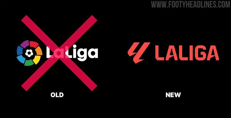
Last year, La Liga unveiled a new logo with a minimalist design style. A year later, Ligue 1 announced a new brand identity with a similarly designed logo. However, these new logos have lost the inherent identity of these two major tournaments. Will minimalist rebranding ever stop?
Will Minimalist Rebrands Ever Stop?
Both the new La Liga and Ligue logos have a minimalist design style and have removed the previously highly recognizable details (La Liga has removed the color wheel, Ligue 1 the silver trophy).
The new logo is not easy to recognize as La Liga & Ligue 1
Ligue 1 2024-25 Logo
The new Ligue 1 24-25 logo is a combination of the letter L and the number 1 (the abbreviation for Ligue 1) with the full word Ligue 1 underneath.

LaLiga 2023-2024 Logo
The new LaLiga logo ditches the iconic color wheel that has been there for 30 years. Instead, the new logo will feature a coral-red color. The coral color (officially Pantone Red 032C) is symbolizing the passion, energy, and excitement of football.

Not only Ligue 1 and La Liga, but also the Premier League changed its logo to a minimalist design style 8 years ago.
2016-2017 Premier League Logo
The new Premier League logo for the 2016-17 season onwards features an all-new design that comes without Barclays name after Premier League announced to remain sponsorless from the 2016-17 season.

Do you like the minimalist design? Will minimalist rebrands ever stop? Comment below.


