AC Milan's Custom Champions League Font Pays Tribute to 2003 Title
 Sep 24, 2023, by Chris
Update: It has been revealed that the design of the Milan 23-24 Champions League font was designed to commemorate the 20th anniversary of the club's sixth Champions League title, with a perforated design reminiscent of that worn in the 2002-03 season.

The white color also matches that of 2003, although we believe that UEFA would not have allowed the barely legible black style anyway.
Curiously, Milan are the first Serie A team to have a custom font internationally since the league introduced a streamlined font a few years ago.
Original article: Milan played their first Champions League match this week, and if you are into football kits or following the club, you surely noticed a major difference to Serie A.

Milan are the first Serie A team not to use the streamlined font of the league
Milan 2023-2024 European Kit Font - First Custom Font Since Introduction of Streamlined Serie A Typeface


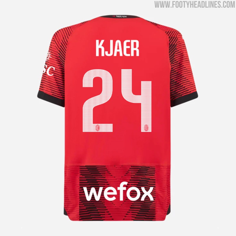
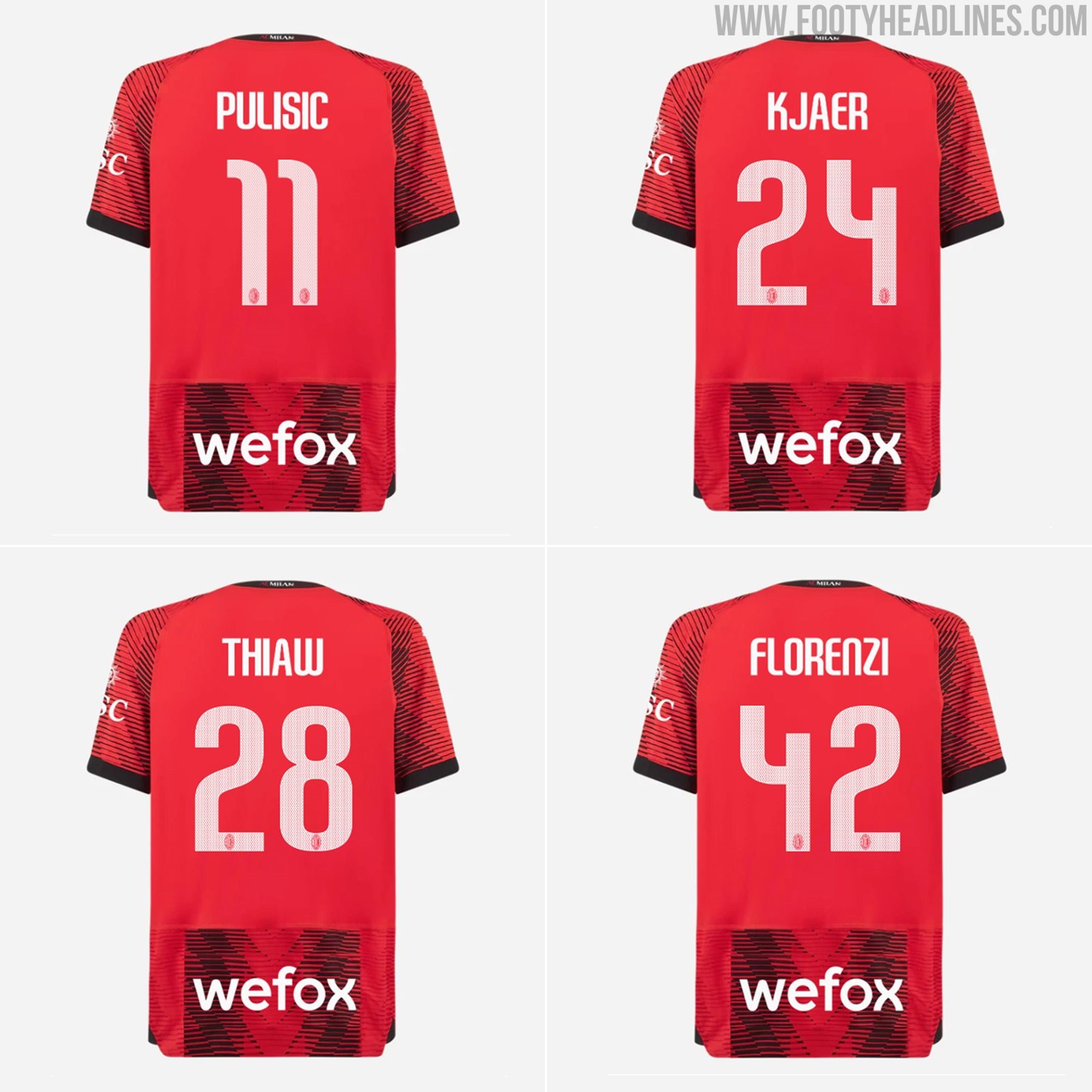
Milan are the first-ever Serie A team to use a bespoke kit font in a UEFA competition since Serie A introduced the streamlined font in 2020.

The custom AC Milan 2023-2024 kit font has a curved style, adding a unique touch to the kit. But the font used is not the only difference from the Serie A font.
Instead of black with a white border (as in the Serie A), Milan used a white kit font in the Champions League.

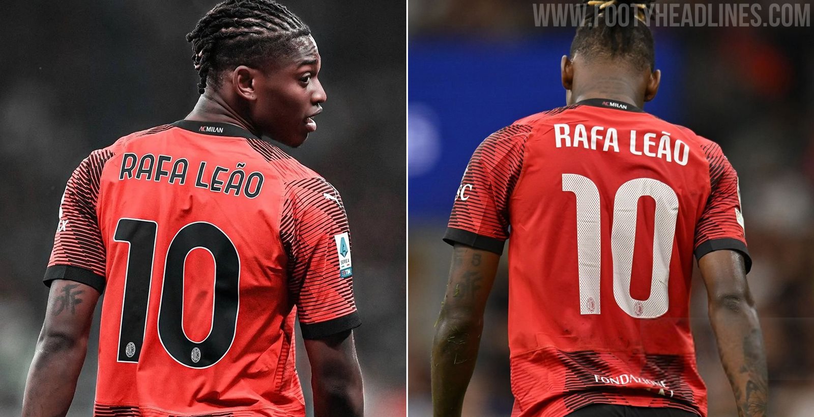
The black names and numbers are badly visible in the Serie A
It is not known if UEFA banned Milan from using a black font for the home kit in the Champions League, but the white names and numbers are much better visible. In Serie A, Milan still use the black font despite its poor visibility.
Milan's European kit font also comes with ventilation holes for better breathability.
Check out old Milan kits on Football Kit Archive


Did Milan made the change voluntarily to improve the legibility of their kit? Let us know in the comments below.


AS Roma 26-27 Away Kit Leaked - Shirt + Shorts + Socks
We have the first official image of the Adidas Roma 2026-2027 away socks. They nicely round off the design.


VVV-Venlo 26-27 Home Kit Released
Netherlands second-division side VVV-Venlo have officially unveiled their 2026-27 home kit, made by Swedish sportswear brand Craft.
The new jersey features a clean and classic design in the club's traditional yellow and black colors, reflecting the identity of both the club and the city of Venlo.
The VVV-Venlo 2026-27 home kit will be available from Monday, July 6, 2026, through the club's official physical and online fanshops.
What do you think of the new VVV-Venlo 2026-27 home kit? Let us know your thoughts in the comments below.


Leipzig 26-27 Away Kit Leaked - 5 New Images
The leaked RB Leipzig 2026–27 away kit features a bold red base with yellow logos and trim, plus a subtle tonal leaf-inspired graphic across the front that may reference the Leipzig Botanical Garden. The striking colorway gives the shirt a distinctive, high-energy look.


FC Barcelona 26-27 Away Training Leaked
Footy Headlines are now able to bring a first look at Barcelona 26-27 Elite Drill Top, collaborating with Kobe Bryant's Black Mamba brand.
The top use the same colorway as Barcelona 26-27 away kit, including purple, black and gold. This design features gold monochrome Mamba and Barcelona logo, as well as the club's name in sharp-angled typeface on the back of the collar.
What do you think of Barcelona 26-27 away training top? Leave your thoughts in the comments below.


Turkish Süper Lig 2026-27 Big Four Kit Fonts Revealed
Following the Turkish Football Federation's decision to abolish the mandatory league-wide Arial font, Turkey's biggest clubs have unveiled their custom typography for the 2026-27 season. Football kits specialist @TheTLdesign has shared the new number fonts that will be adopted by Fenerbahçe, Galatasaray, Beşiktaş, and Trabzonspor, marking a definitive end to the unified font era and giving each club a distinct visual identity on the pitch.
The revealed designs showcase unique approaches for each of the four teams. Galatasaray introduces a modern, angular typeface that answers long-standing supporter requests for a bespoke look, while Fenerbahçe, Beşiktaş, and Trabzonspor have also opted for stylized numbers that align with their respective club branding. The move to individualized fonts allows the teams to fully customize the backs of their shirts for both domestic and European competitions.
This shift represents a significant aesthetic upgrade for the Süper Lig. Fans have widely praised the transition away from the generic numbers used in previous years, with many expressing a preference for these unique designs that better reflect the character of Turkey's top football institutions.


FC Barcelona 26-27 Third Training Leaked
We now can provide a closer look at the kid version of Barcelona third training kit for 26-27 season,
The design feature turquoise base with blue and garnet details - matching the 26-27 third kit in colors, along with the club's name in bold and striking font on the shorts and the back of the shirt, similar to that under the third kit's collar.
What do you think of Barcelona 26-27 third training kit? Leave your thoughts in the comments below.


No More Nike: Robey KVC Westerlo 26-27 Home Kit Released
KVC Westerlo have officially unveiled the KVC Westerlo 2026-27 home kit. Made by Robey Sportswear, it is the club's first kit since the Dutch brand replaced Nike, ending the American brand's four-year spell as Westerlo's official kit supplier (2022-2026).
The home shirt stays true to Westerlo's traditional yellow and blue colors while celebrating the club's strong bond with its supporters. Unveiled under the slogan 'Designed for you. Worn by you. Because you are Westel' the custom-made design highlights the connection between the club and the Kempen region.
The KVC Westerlo 2026-27 home kit is now available through the club's official online store.
What do you think of the new KVC Westerlo 2026-27 home kit? Let us know your thoughts in the comments below.