Should Nike/Inter Have Gone For All-Yellow Logos For New Special 22-23 Home Kit?
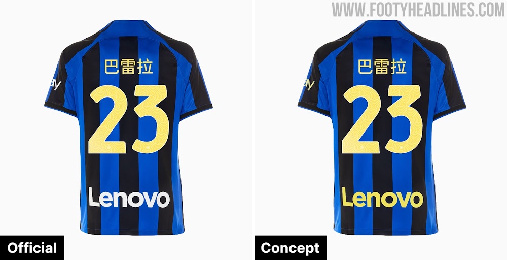
Yesterday, Inter Milan released a special Chinese New Year edition of their 2022-2023 home kit featuring a yellow kit typeface. Would it looked have better with all-yellow applications?
Inter 22-23 Chinese New Year Home Kit With Yellow Logos
The Inter 22-23 CNY home kit comes with a yellow kit font instead of the white font of the regular home kit. All other elements were not changed, resulting in a mismatched yellow/white look.
We have imagined how the Inter 22-23 home kit would look with yellow logos that match those of the Chinese New Yellow font. For us, is certain that the CNY edition would have looked better with all-yellow logos. We also think that yellow logos greatly fit with the 22-23 home kit in general.
Nike were probably not involved in the creation of the special CNY kit
Of course, it would not have been easy for Inter to have a Nike home kit with all-yellow logos. In fact, Inter could create the CNY without any help from Nike as they just printed logos on the standard kit.
We think that it is still a missed opportunity by Inter here. An actual special-edition kit with all-yellow logos would have been much more impressive than the "half-assed" official CNY Kit.
White or Yellow For Inter 22-23 Home Kit? A Matter of Personal Preference

So, do the yellow applications look better than the white ones in general? In the end, it is a matter of personal preference. Some people may prefer the standard white applications, while others may prefer yellow applications.
For those preferring an Inter kit with yellow logos. For the 2023-2024 season, Inter will get a home kit with yellow logos.
White or yellow? Which application color do you prefer for Inter in general? Let us know in the comments below.


