Is There a Hidden Meaning Behind Germany's 1990 World Cup Shirt?
There's an intriguing theory about the origins of West Germany's famous 1990 World Cup winning shirt design, but could is there any truth to it?
The Hidden Meaning of West Germany's 1990 World Cup Shirt?
It regularly takes the number one spot on "best kits of all time" lists and for good reason. West Germany's brilliant 1990 home shirt is instantly recognisable thanks to its central design element. Three stripes in the colours of the German flag run diagonally from the right shoulder down to stomach level, then begin to rise again before quickly levelling off across the chest, and finally shooting back up to the shoulder as they reach the left hand side of the shirt.

The design was also applied to track jackets and sweatshirts.
A fantastically novel way for Adidas to incorporate their world famous trademark into the jersey while simultaneously instilling it with plenty of national identity and pride. And most importantly, it just looks great. That's how it's been viewed by most of the world since it was released over 30 years ago, but an alternative theory that gives those famous jaunty lines a mathematical and even prophetic significance.
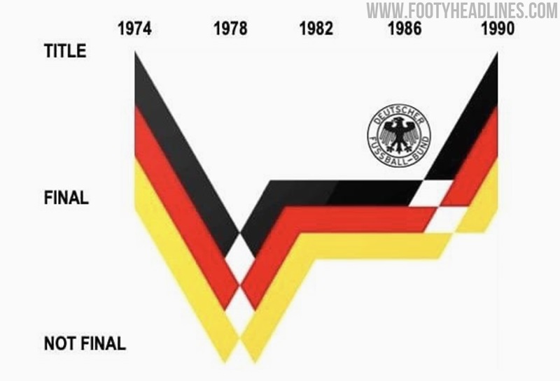
The theory is that the stripes are basically a line graph tracking West Germany's progress at previous World Cups. Starting from their triumphant 1974 campaign, the line drops to the low of group stage elimination in 1978. It then rises to the level of runner-up and remains steady to denote repeated second place finishes in 1982 and 1986, before surging to the top once more as they were crowned winners again in 1990.
Now obviously, the shirt was designed in advance of the 1990 World Cup - in fact it was originally launched in 1988 for that year's Euros - so the final ascent of the lines represents the designers mixing their hopes/dreams/expectations with the historical data of the preceding tournaments. The team then demonstrated some famous German efficiency to render the graph accurate by claiming the trophy.
Is It True?
It's certainly a fun and interesting theory, but whether there is any truth to it is up for debate. The shirt was made for Euro 88 so surely it would have made more sense to plot the graph using their previous finishes at that tournament instead. Also, Adidas had been giving Germany a new home kit for each international tournament since 1982. The Euro 88 kit was reused for the 1990 World Cup, likely due to its popularity, but probably wasn't initially intended to be worn at that specific tournament.
The shirt will remain a classic whether or not the theory is true, but it would definitely give it an extra dimension of appeal if someone at Adidas confirmed it. What do you think? Is the pattern really based on the graph or is the correlation just a coincidence? Have your say in the comments.


