
Anything But a Revolution: Swedish Club AIK Update Logo
 Nov 19, 2022, by Chris
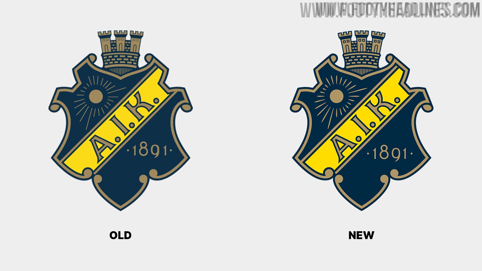
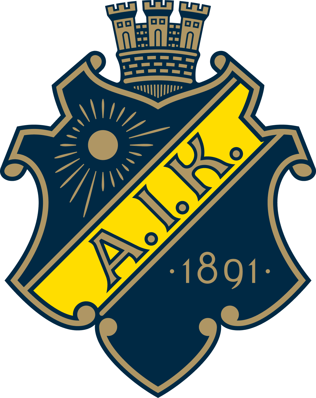
Swedish club AIK Fotboll have updated their club crest. The new AIK logo is a small update of the previous crest that has been more or less the same since 1975. Thanks to @WorldClubCrests for making us aware.

AIK's minimal update stands in stark contrast to Juventus, Gamba Osaka, and many other teams
AIK subtle crest restoration stands in stark contrast to the logo changes of various other teams in recent years, including Juventus, Gamba Osaka, and Inter Milan.
AIK Fotboll 2022 Logo
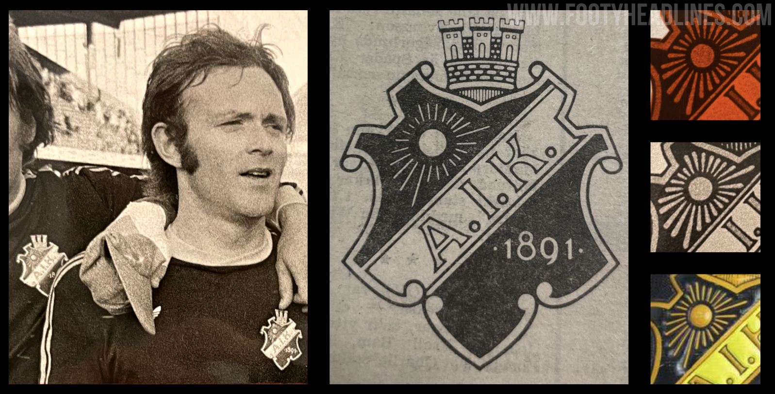
The new AIK logo is based on the original version from 1975. AIK decided to update their logo because the "previous original had details that were too fragile for print, difficult to see on a small screen and also some illogical execution of line widths and spacing".
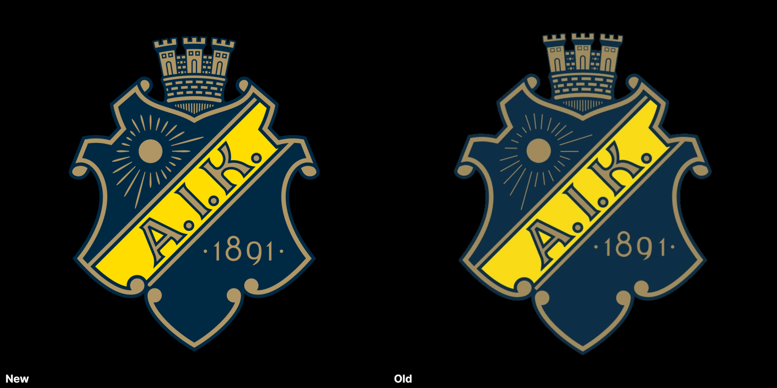
AIK's goal with the club redesign was to have a new crest that fits the modern requirements while "being as close to the original from 1975".

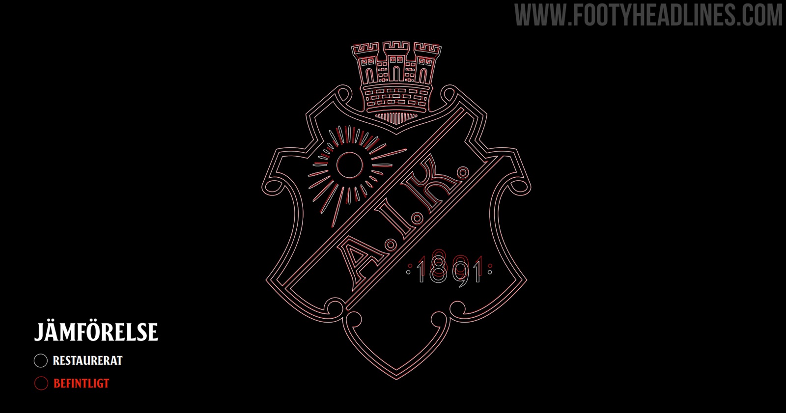
Indeed, the new AIK logo looks almost identical to the previous crest if seen alone. The club also highlighted which elements have been updated, and why the club did so.
New AIK Logo - Changes

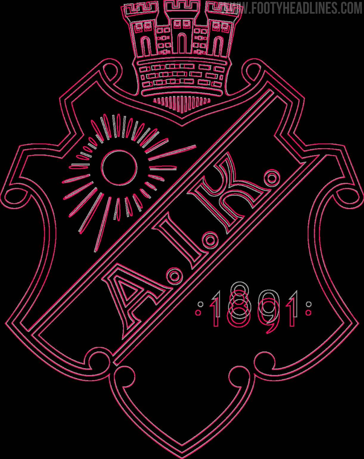
- Tower elements should have the same line width, roundings and spacing. Start from a circular grid that gives all the different parts the same perspective
- The sun's rays should become clearer, emanate from the center of the sun and be evenly distributed
- The end of the beam at the bottom left should be rounded
- The typography of the year is changed to AIK Numbers (they are the same numbers but fine-tuned by the font experts at Familjen)
- The blue and yellow colors become clearer
- Letters and spaces in the word picture AIK are fine-tuned
- The background is adjusted so that it is perceived as wide all around
- The scrollwork is adjusted so that it is not perceived as angular, but more teardrop shaped
You can find all about the restoration of the AIK logo on their website.


Do you like that AIK decided to only update their iconic crests instead of launching an all-new logo? Comment below.



Brunei 2026 Home & Away Kits Released: Bold New Looks for the Wasps
Brunei have officially revealed their brand-new home and away kits for the 2026 season, bringing fresh and eye-catching designs to Southeast Asian football.
The home jersey proudly showcases Brunei's traditional national colors, utilizing a vibrant yellow base accented by striking black and white details that mirror the nation's flag. The design blends cultural heritage with a modern athletic fit, ensuring the team looks sharp when playing on home soil.
Complementing the home strip, the new away kit offers a sleek and contrasting aesthetic, typically featuring a dark or alternate colorway that gives the Wasps a fierce and formidable look for their travels abroad. Both shirts are crafted from lightweight, high-performance fabrics designed to keep players cool and agile on the pitch.

Perth Glory 2026-27 Home & Away Kits Released: Celebrating 30 Years of History with Macron
Perth Glory have officially unveiled their brand-new home and away kits for the 2026-27 season, crafted by technical partner Macron. This release marks a monumental milestone for the club as they proudly celebrate their 30th anniversary campaign.
Guided by the commemorative motto "History Redefined," the new collection beautifully bridges the gap between honoring the club's rich heritage since 1996 and embracing a modern aesthetic. The home kit stays true to Perth Glory's iconic purple and orange identity, while the away shirt offers a fresh, striking design tailored for battles on the road.
Both jerseys feature special celebratory details acknowledging three decades of football alongside Macron's signature performance technology, ensuring top-tier comfort and style for both players and supporters.


Sydney FC 2026-27 Away Kit Released: A 90s-Inspired Tribute to the Harbour Bridge
Sydney FC and technical partner Under Armour have officially unveiled the club’s new away kit for the 2026–27 A-League season. Following the recent release of their land-and-sea-inspired home shirt, the new away strip turns back the clock with a bold, 90s-infused aesthetic celebrating the city's most iconic landmark.
The new away jersey features a crisp white base layered with striking graphics in Sydney FC Sky Blue and navy. At the heart of the design is a retro graphic pattern inspired by the unmistakable shape of the Sydney Harbour Bridge, blending vintage nostalgia with modern streetwear appeal.
The new Sydney FC 2026–27 away kit is available now via the club and Under Armour official online stores.


Full Jordan PSG 26-27 Third Kit Look Leaked - Shorts Feature Matching Graphic
We can give you an almost full look at the Jordan Paris Saint-Germain 26-27 third kit, confirming that the design extends directly onto the shorts. Our mockup is modeled by Ousmane Dembélé, the uniform combines the dark base and multicolor blurred central Hechter stripe of the jersey with matching shorts that replicate the textured vertical line motif, completed with vibrant red Jordan Jumpman and PSG crest detailing.


AS Roma Alba-Audace 27-28
Roma takes it back for the 2027-2028 centenary season. Detailed info about the set soon on Footy Headlines.
