Al Hilal Reveal New Logo - Complete Redesign
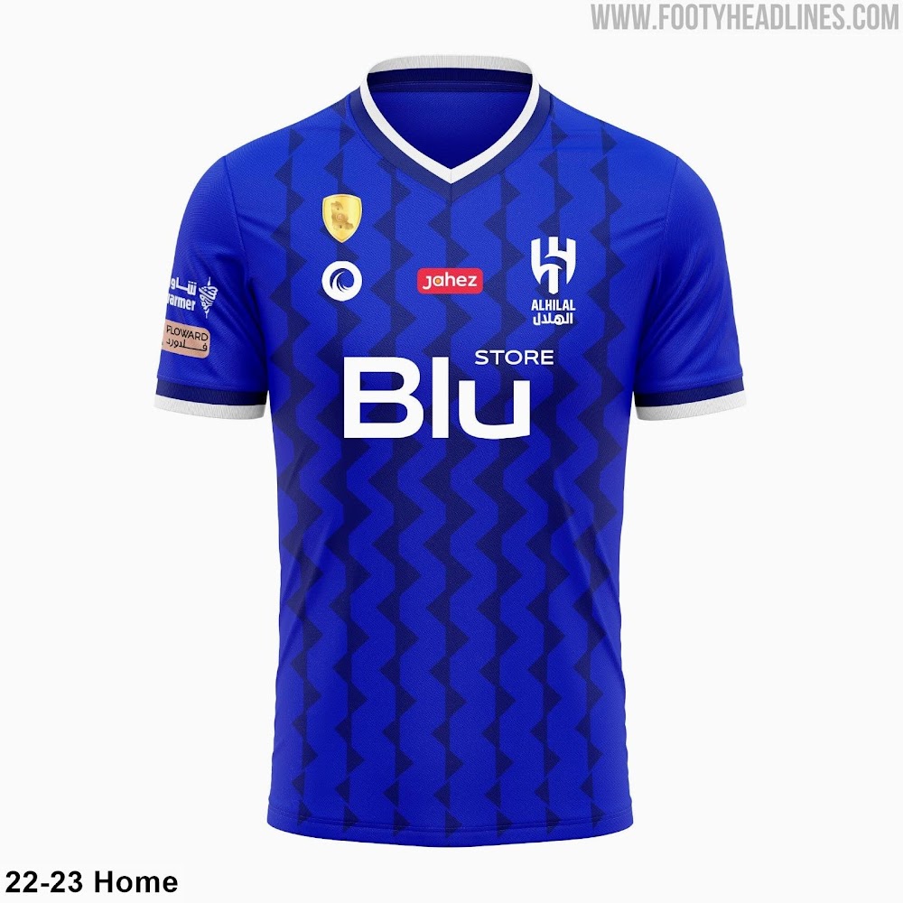
Over the past summer, Saudi Arabian club Al Hilal revealed an all-new club logo. Let us take a closer look.
We are #AlHilal
— AlHilal Saudi Club (@Alhilal_EN) August 22, 2022
We are unique 😍pic.twitter.com/yzIPj2BeqO
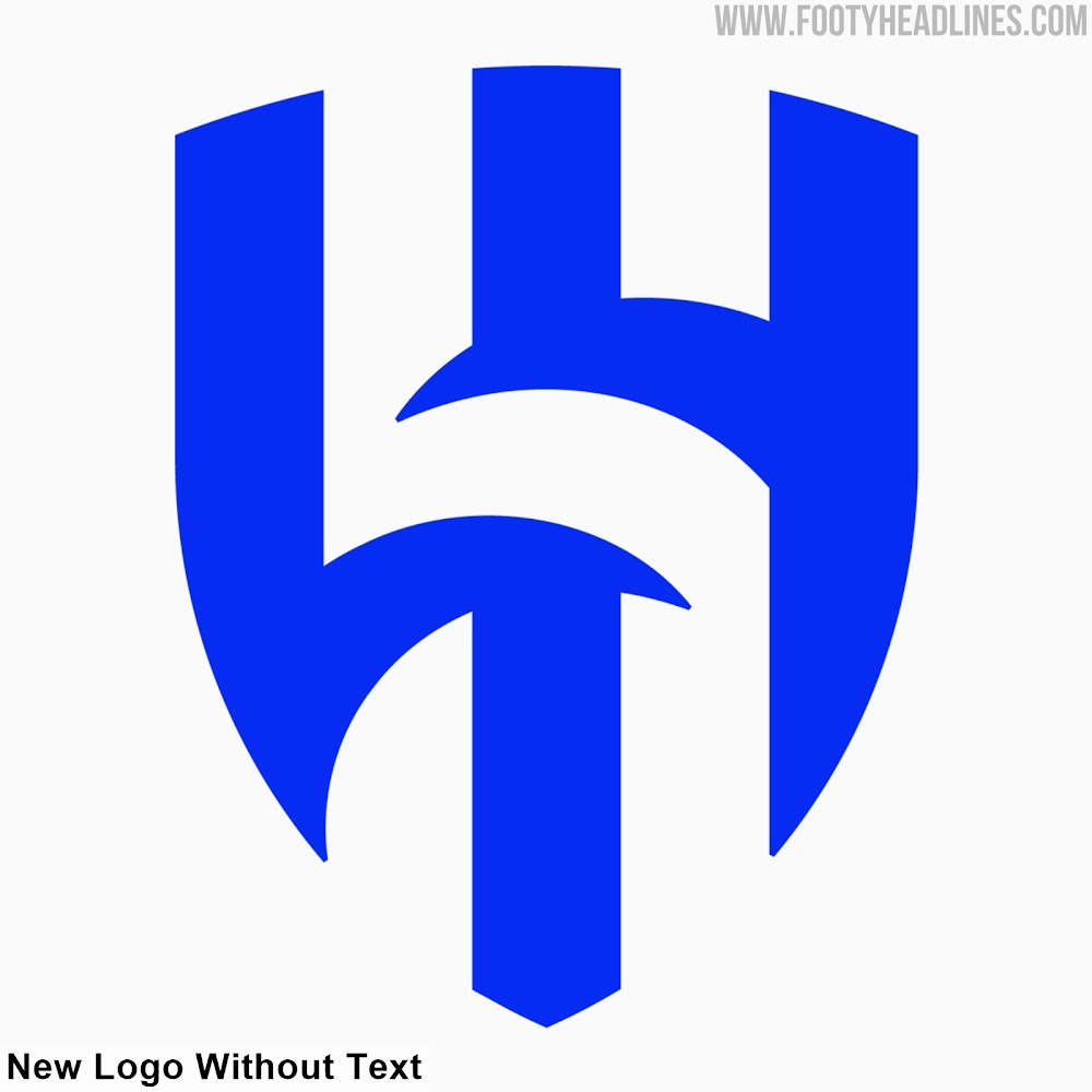
Al Hilal New Logo
Here is a side-by-side comparison of the old and new Al Hilal logos.
Unlike some clubs, who merely update an existing badge, Al Hilal opted for a complete rebrand. Their new logo has a completely different look from the old one.
While the old crest had a slightly outdated appearance with a 3d effect and a gradient, the new logo does away with these elements. It goes for a design in only blue and white, with the empty space between the three vertical blue stripes and their crescent moons creating a white 'H' for 'Hilal'.
The old design with the ball inside the crescent moon is thereby partially adapted, the full text with the club name and founding year are done away with however. One version of the new Al Hilal logo does feature the name underneath, with the other option leaving this away.
In general, Al Hilal's new logo is much more adaptable to the digital environment, also allowing for more versatility in terms of colors.
What do you think of this facelift for Al Hilal? Comment below.


