Never Seen Before: 11 Manchester United 90s Prototype Shirts Revealed
Every now and then previously unseen photos of sample or prototype football kits surface on the internet, giving us a look at some of the ideas that brands came up with but ultimately didn't get used. Author and Manchester United writer Wayne Barton has shared a selection of shirts that Umbro proposed to United in the 90s and early 2000s, but were rejected in favour of other options.
Umbro Manchester United 90s Prototype Shirts
A long time ago, before they became the laughing stock of world football, Man Utd used to be a very successful, well-run club. During the 90s they won pretty much every trophy they could, wearing Umbro kits as they did so. Umbro took over from Adidas as United's kit suppliers in 1992 and stayed in the role for ten years, until Nike replaced them in 2002.
In that time they produced some real classics, but some of these rejected or unused designs could well have gone on to be just as iconic if things had been different. Check them out below.
92-94
The first shirt pictured above is the design that was used for Umbro's first United home jersey, but this version without the Sharp sponsor logo was never released.
This design was proposed for the same season, featuring a lot more white than we're used to seeing on United home kits, possibly one of the reasons it wasn't chosen. Aston Villa and Napoli made use of the same template.
This one may look familiar as it basically the same as the blue away shirt that they wore that season, but with a different colourway and collar.
United's famous half green half yellow shirt pays tribute to the club's origins as Newton Heath. This proposal took the reference several steps too far, combining the current United crest with the Newton Heath badge for a nauseating look that also obscured the Umbro logo and stitched on club badge.
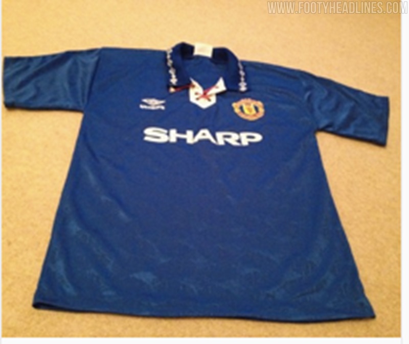
The lace-up collar on this blue away shirt suggests it dates from the 1992-1994. Not a bad look.
93-95
This black away kit may have been proposed as an alternative to the one in which Eric Cantona famously kung-fu kicked a fan. If that is indeed the case, United made the right call there. It could also have been a possibility for the 98-99 season, when another black shirt was the third kit.
98-99
This design is essentially that season's home kit, but in blue. A great template, this jersey would likely have been a success.
The white version is even better, as the combination of red and black accents give it that little extra. Probably the best of the bunch.
99-00
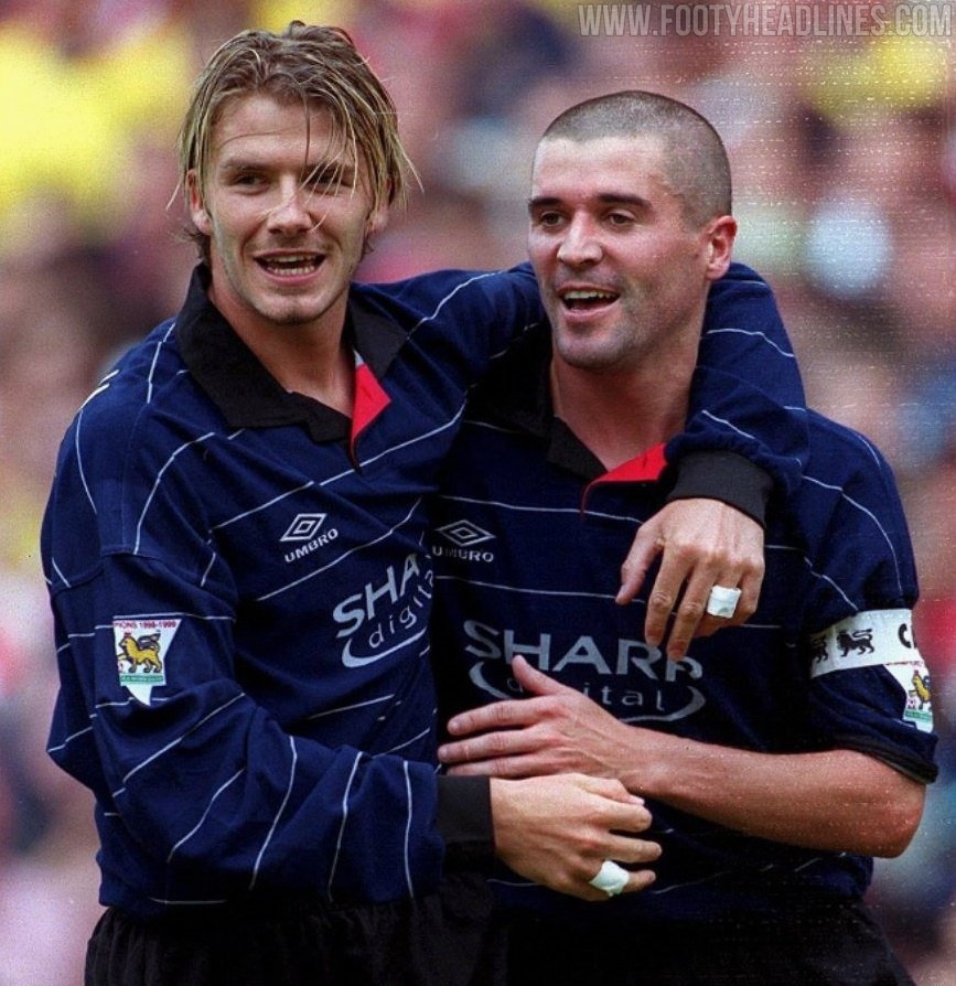
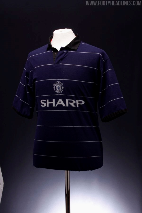
A slightly different version of the 99-00 away shirt with a centralised badge. The placement of the Umbro logo isn't shown here, so hard to say how the final, finished version would have compared to the shirt that was released.
00-01
The year 2000 was when Vodafone replaced Sharp as shirt sponsor, but this prototype - essentially the final home shirt - was obviously made before the Vodafone deal came about. Umbro also updated their logo around this time, elongating the double diamond and dropping the text, as it appeared on the final version.
This goalkeeper shirt didn't get chosen in the end either, as some more modern designs were preferred.
What do you think of these prototypes? Did Manchester United go for the wrong option on any occasions? Comment below.


