New Costa Rica Logo Unveiled
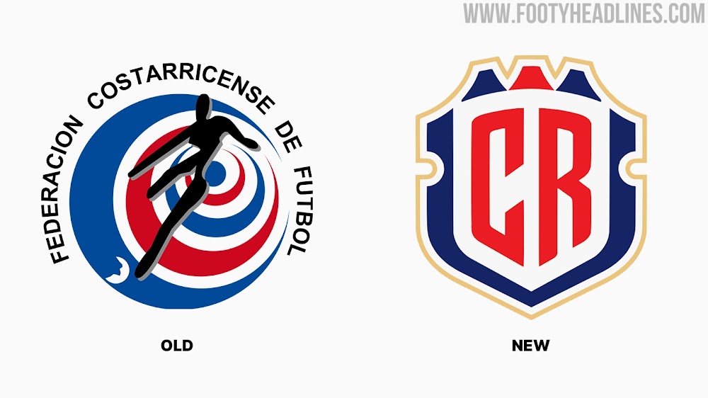
The Costa Rican Football Federation (FEDEFUT) last night presented their brand-new logo, which will also be used by the Costa Rica national teams in the future.
Costa Rica Logo
Check out the previous and new Costa Rica logos below.
The new Costa Rica logo draws inspiration from the national flag and its three colors as well as the National Shield, from which it derives its shape.
“We want the new brand to represent Costa Rica, a brave country, full of volcanoes, strong colors and elegant shapes. A country of good football and with an institution of international reference”, said Carolina Ulloa, Director of Marketing and Communication at FEDEFUT.
Dozens of people were interviewed as part of the project, including the current squad, former players, journalists and officials of the Costa Rican Football Federation.
The new logo was designed by the PUPILA agency. “We searched the graphic history of the Federation, as well as the visual identity and Costa Rican national symbols. We visited museums and galleries, we studied books and websites and, under the idea of 'The history of the future', we summarized our intention to look for an emblem that represented Costa Rica, but translated into an image that looks to the future”, commented Matti Vandersee, Art Director.
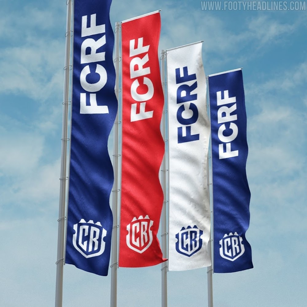
The project includes its own typeface, much more modern, which provides a more solid appearance. And that is inspired by the flag and shield of Costa Rica, based on the colors of our flag, the tricolor, with an adjustment of the hue of blue, making it slightly darker to create an environment of greater contrast. The golden hue (used in the latest variants of the previous identity) is also integrated into this redesign, with the aim of highlighting the teams as the elite of national football.
Costa Rica currently sit in fifth place of the CONCACAF qualifiers, which would not entitle them to participate in the 2022 World Cup.
What do you think of the new Costa Rica logo? Comment below.


