The Hidden Meaning Behind Brand Logos
Last month @The_Kitsman shared a very interesting thread on Twitter, highlighting the hidden meanings behind some of the biggest football brands.
Kappa
The now-iconic Kappa logo was a happy accident that occurred during a 1969 photo-shoot. The photographer spotted a man & woman sat back to back, with his becoming the base shape for the brand logo.
Adidas
The three stripes of the modern-day Adidas logo represent a mountain, pointing out towards challenges & goals in which people need to overcome.
Mizuno
Mizuno's logo draws inspiration from the Roadrunner bird. It came to life during the launch of the RunBird line of shoes in the 1980s.
Upon seeing the finished product for the first time, Masato Mizuno, then Chairman of the Mizuno Corporation, was immediately impressed with the exciting new design, stating, “Birds called roadrunners exist. Our shoes now look like running birds.”
The Japanese brand is set to increase its presence in the European football market next season, with rumors afloat about them taking over the Bochum contract from Nike.

Nike
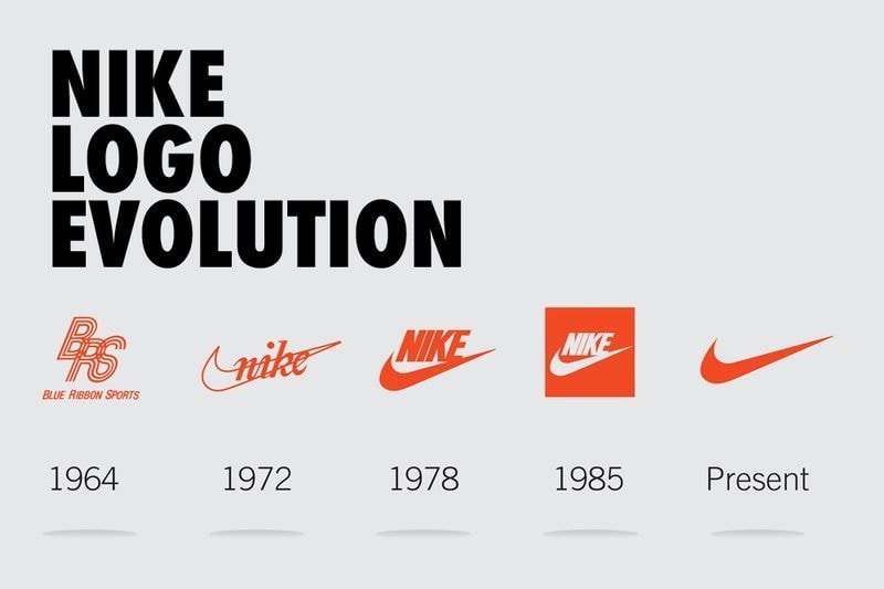
Nike's Swoosh, one of the most recognizable brands around today, was created by a graphic designer named Carolyn Davidson in 1971 for a mere $35! The inspiration behind the shape was conveying motion, while the name Nike of course derived from the Greek Goddess of victory.
Make sure to check out the full thread for more of these. It might even get expanded with more brands in the future, who knows...
Did you know all of this? Comment below.


