In Detail | Adidas World Cup Fonts Throughout History | 1990-2018

With Adidas having released their 2018 World Cup home kits featuring the new World Cup typeface, we take a look at all Adidas World Cup fonts between 1990 and 2018. Thanks to Paladar Negro, Switch Image Project & some other great websites for information and pictures.

Adidas 1990 World Cup Font

Adidas' 1990 World Cup typeface boasts a simple 3D look.
Adidas 1994 World Cup Font
Argentina and Spain's 1994 World Cup typefaces were different to the typefaces other Adidas countries used.
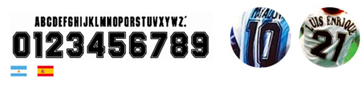
The Adidas 1994 World Cup font in the United States is the same as the one used for the 1990 World Cup. The US national team, however, received an own unique & modern font from the Three Stripes for their home World Cup.

Adidas 1998 World Cup Font

The Adidas 1998 World Cup typeface is also unchanged from before. Germany and Spain, however, received different, unique fonts for the tournament.
Adidas 2002 World Cup Font

The Adidas 2002 World Cup typeface is completely different to the previous fonts Adidas teams used at the World Cup boasting a modern design. The leap forward from the classic 1998 World Cup font is remarkable.

Adidas 2006 World Cup Font

The most famous Adidas World Cup font font to date, the Adidas 2006 World Cup typeface is a design classic. The style is inspired by the typeface designs used in the 1974 World Cup.

Adidas 2010 World Cup Font

A much less remarkable look than the 2006 World Cup typeface, the Adidas Unity 2010 World Cup font draws inspiration from the whole 2010 World Cup theme.


Adidas 2014 World Cup Font

The 2014 World Cup typeface features a modern yet unique design.

Adidas 2018 World Cup Font

For the 2018 World Cup, the Three Stripes decided to add for the respective crest of each federation on the bottom for the first time in order to give the numbers a more custom feel. Find out all you need to know about the Adidas 2018 World Cup typeface.


Which of these Adidas World Cup font is your favorite? Let us know in the comments below.
Vintage Football Shirts
from Cult Kits
2011/12 Torino Home Shirt (M) Kappa

1993 Yokohama Flugels Home Shirt (M) Puma

2012/14 Wigan Mi-Fit Polo Shirt (S)

2016/17 Porto *BNWT* L/S Third Shirt (Multiple Sizes) New Balance

2003/04 Spain Training Jacket Top (S) Adidas

2015/16 Raith Rovers Polo Shirt (S) Puma

1994 Italy R.Baggio #10 Home Shirt (XL) Diadora

Japan Nakamura Bootleg Tee

2014/15 Bayern Munich Ribery #7 Third Shirt (L) Adidas

2012/13 Marseille *Player Issue* L/S Third Shirt (L) Adidas


Turkey 2026 World Cup Pre-Match Shirt Revealed - Streamlined Nike Template for Smaller Nations
Nike's preparations for the 2026 World Cup are being finalized with the reveal of the new Turkey pre-match shirt.
Rather than receiving a bespoke design, the new Nike Turkey 2026 World Cup pre-match jersey utilizes a highly visible, streamlined template that the American sportswear brand will be rolling out across its wider portfolio of sponsored national federations.
The defining feature of the Turkey 2026 pre-match shirt is its bold, all-over geometric graphic. The template consists of tightly packed, wavy zig-zag lines that warp and curve to create a dynamic optical illusion across the entire torso and sleeves. For the Turkish national team, this busy pattern is executed in vibrant, contrasting shades of red and dark orange.
Nike is applying this exact same streamlined template to several other national teams, simply adjusting the color palettes to suit each country. European sides like Norway and Finland, alongside South American heavyweights Uruguay, will all sport identical pre-match designs featuring their respective national colors applied to the same wavy graphic.
What are your thoughts on Nike utilizing a shared, streamlined template for its 2026 national team pre-match shirts? Let us know in the comments below.

