8 Biggest Sponsor Upgrades of the 22-23 Season
As all football kit fans know, a good-looking chest sponsor can make or break a shirt. Purists might say that no sponsor is best, but unfortunately in the world we live in, sponsorless kits are a rarity. With the majority of new kits now released and the new season upon us, we’ve chosen our 8 best 22-23 sponsor upgrades.
8 Biggest Sponsor Upgrades of 22-23
The criteria for this list are simple. The sponsors must either be an updated or modified logo from last season, or a completely new logo on the shirt for the first time in 22-23. We have listed them in no particular order, but feel free to rank them as you wish in the comments.
Spotify - Barcelona
One of the most talked about sponsorship deals in recent years and a welcome union of football and music. We’ve only seen the basic Spotify logo on Barca’s shirts for now, which looks quite nice, but they have said they want to use the space in innovative ways such as promoting various artists throughout the season, so it will be genuinely interesting to see how this one evolves.

Classic Football Shirts - Burnley
A football shirt site having their logo featured on a football shirt, this has to be one of the most fitting deals ever. Umbro have even referenced a classic Burnley kit from the 90s for their 22-23 home shirt, making it the perfect season for CFS’s debut. Also a huge upgrade on the numerous ugly betting firms that have graced Burnley's jerseys over the last few years.
Cinch - Crystal Palace
Getting rid of a betting sponsor is always good. It’s even better when the logo is replaced with something clean and tidy. The W88 logo has made way for car rental company Cinch on the front of Crystal Palace’s shirts, whose clean and simple text logo is coloured to match the colours of the home, away and third shirts. A step up in terms of chest and technical sponsors this season for Palace, who also switched from Puma to Macron.

Motorola - Monza
Shirts manufactured by Lotto with a Motorola logo on the front, Silvio Berlusconi in the boardroom and a slew of Italian internationals recruited over the summer. There is definitely a throwback feel to this Monza team, who will compete in Serie A for the first time ever this season. The monochrome Motorola logo is a big improvement on last season’s sponsor with its clashing part-orange text. It’s just a shame that the awfully-placed U.Power logo remains.

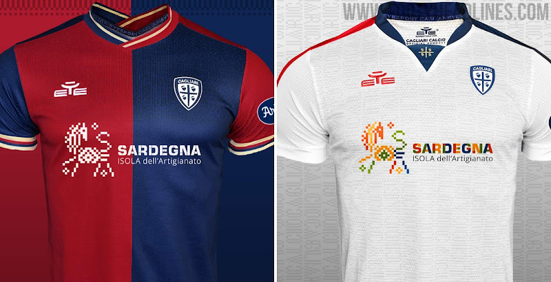
Sardegna Turismo - Cagliari
The club from the southern tip of Sardinia have been using their kits to advertise their stunningly beautiful island as a tourist destination on and off for over ten years now. In that time, various logos have been used. Updated once again for the 22-23 season, the text has been reordered and realigned, tying it in better with the tapestry-like image of a horse, which has also been retouched itself.
Sardinian beer Ichnusa has been absent from the shirt for a couple of years now, but the club have teamed up with Eye Sportswear - also from the island - as technical partners, so there’s plenty of local pride in their jerseys. Eye have unified everything by including traditional patterns and graphics in the fabric that are similar to those used in the Sardegna logo.

Lotus - Norwich
Lotus win old-school points for being both a local company and a car manufacturer, but the main reason for their inclusion here is the simplified logo which fits much better on Norwich’s shirts than last season’s iteration. Stripped back to just the Lotus text, it’s hard to imagine a better look to complete Norwich’s retro-inspired home and elegant away shirts.

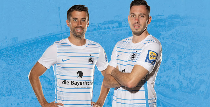
Die Bayerische - 1860 Munich
Die Bayerische have appeared on the Bavarian clubs’ shirts since 2015, and the lion’s head logo mirrors the club badge. This year’s kit includes the sponsor in a way that is much less disruptive to the design when compared to the white box used last season, interrupting the stripes and really taking away from the overall look. All clubs and sponsors should take note of this style of application.

No Sponsor - Nottingham Forest
Bending our own rules slightly here, the change from last season is obviously the complete absence of a sponsor logo in this case. Previous sponsor Boxt proposed a renewal of the deal but Forest are said to be holding out for a more lucrative offer, which they have yet to receive. For now it looks like they will start the season with a blank shirt, a real rarity in the Premier League and a sight to behold.
What do you think of our choices? Have you got any to add to the list? Comment below.


